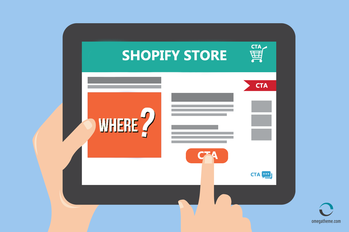
Among thousands of reasons for customers to access your store, your ultimate goal is to encourage them to take action, your customers might get lost and leave your store if you won't give them the directions. CTA buttons advise specific activities so that your customers can know exactly what they should do and where they should go.

Your CTA buttons need to be visible, not distract, not irritate your customers and also not disturb your store design, to do this, the placement of your CTA buttons is one of the priority factors.
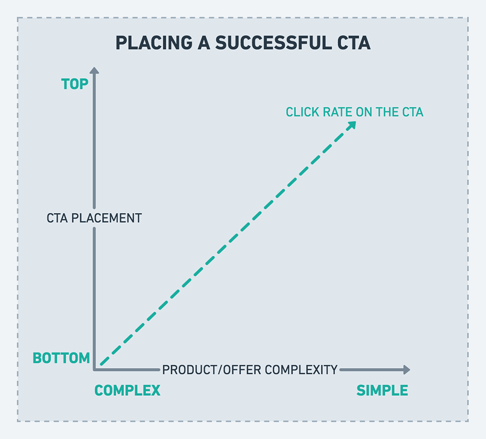
Where to place your CTA on your website can influence its performance. You might get stuck to choose whether it should be above the fold, below the fold, left or right. Traditionally, CTA buttons were used to mostly above the fold, however, it much depends on the complexity of the content on your page. Through alpha/beta testing CTA buttons were linked to phone number in profiles. This gave the best possible results.
You should place the CTA buttons below the fold for the complicated and long content; and above the fold for content with less information.

So left, right or center-aligned buttons?
Partially based on the “Z” pattern, you can acknowledge the eye-catching part on your page, however, reassure that these locations will not make any conflicts with your content flow. On your page, if the eye ends up at the bottom left, place the button there, if the content follows the center structure, locate the button at the center.
Think about your smartphone users
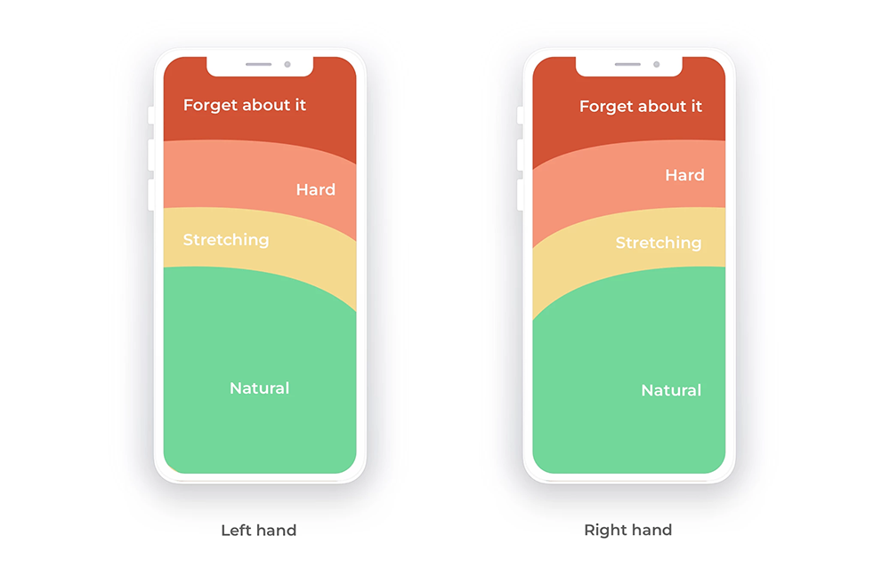
Users are increasingly using their smartphones to do shopping. Learning your buyer’s behavior can help you place your buttons to target the audience. For example, based on ages, users can be segmented into 2 categories: young users and middle-aged plus older users.
Younger users touch the screen only with their thumb, therefore, putting your CTAs within the thumb zone will be convenient for them to take action.

On the other hand, middle-aged and older users use one hand to keep the phone and the other hand to touch, so the ideal location for CTAs is in the middle and at the top of the screen.
Designing CTA buttons not only includes placement, but also considers text, size, and color. For whatever settings you made and changes you applied on CTAs in your Shopify, it is always important to do A/B testing as it totally can affect your marketing campaign and lead you to good results.
How to add call-to-action buttons in Shopify website
There are two ways that you can add the buttons into your theme.
First, you can code the buttons into the theme you want, it can be suitable for those who have basic knowledge of coding. However, it might struggle if you would like to add many secondary buttons in your store such as chat buttons, direction buttons to navigate the customer’s actions. The second way which is easier is using an app, for example CTA buttons app on Shopify.
There is no one rule for all E-commerce stores, but from the core ideas, you can develop effective CTA buttons for your website. Get your call-to-action right, then you can see how it increases your conversion rate and grows your sales.
