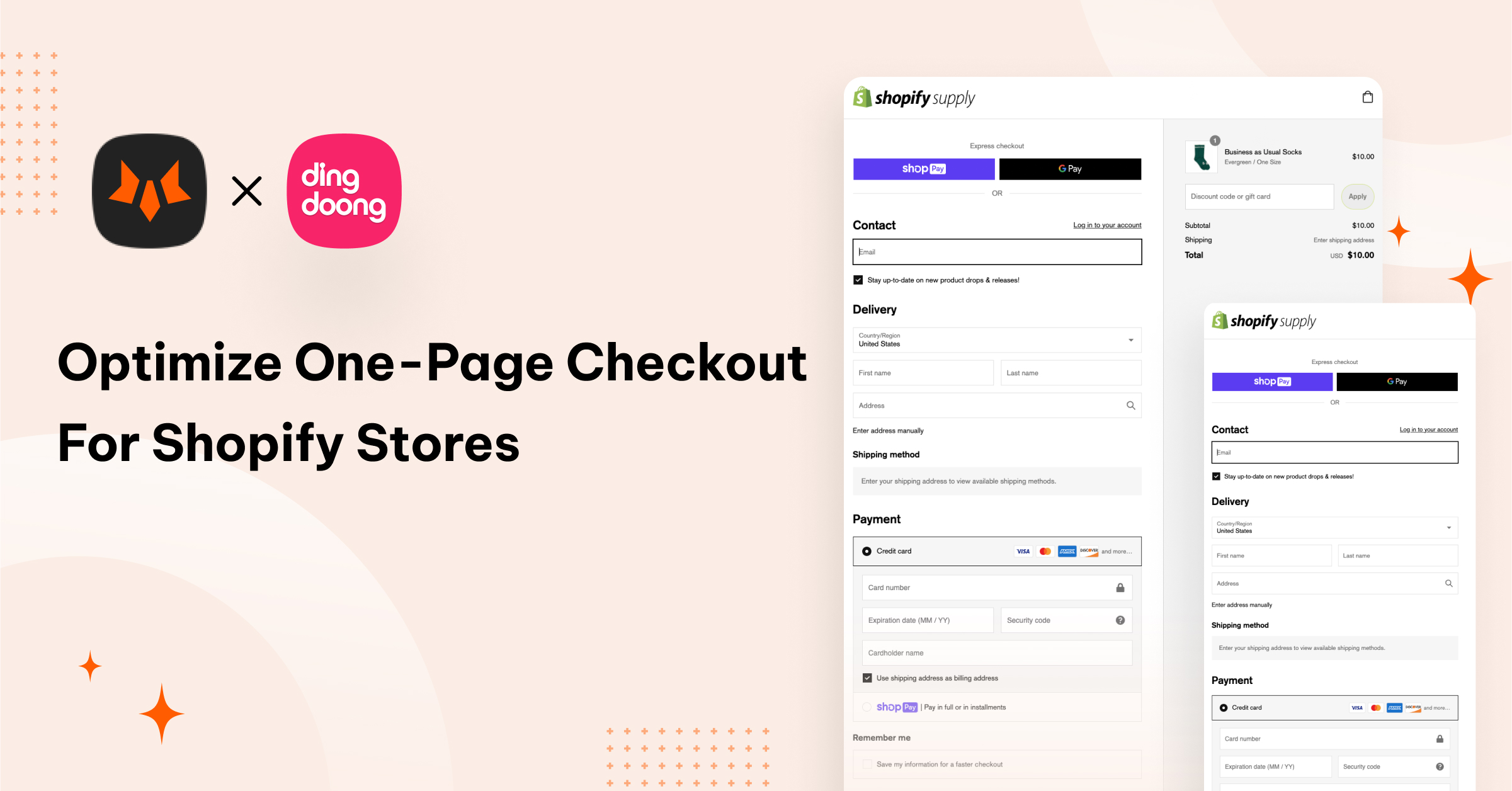
Shopify, with a range of powerful tools for checkout optimization, has long been a go-to platform for online store owners. One such tool, the one-page checkout, was once an exclusive privilege reserved for Shopify Plus users. However, here's the exciting news: this feature is now accessible to online store owners across all Shopify plans!
In this comprehensive guide, we'll delve into the topic of one-page checkout, exploring the strategies to create and optimize them for your Shopify store. We'll unveil the secrets to boost conversions, reduce cart abandonment, and enhance the overall shopping experience for your customers. Let's embark on this journey to a more efficient, profitable online checkout process together.
In the fast-paced world of eCommerce, the checkout process stands as a pivotal factor as the sales volume you’ll process in your store depends on the effectiveness of your checkout. It's where potential buyers either seal the deal or abandon their carts. Thus, checkout optimization has long been the holy grail of eCommerce businesses.
Shopify, with a range of powerful tools for checkout optimization, has long been a go-to platform for online store owners. One such tool, the one-page checkout, was once an exclusive privilege reserved for Shopify Plus users. However, here's the exciting news: this feature is now accessible to online store owners across all Shopify plans!
In this comprehensive guide, we'll delve into the topic of one-page checkout, exploring the strategies to create and optimize them for your Shopify store. We'll unveil the secrets to boost conversions, reduce cart abandonment, and enhance the overall shopping experience for your customers. Let's embark on this journey to a more efficient, profitable online checkout process together.
Shopify One-page Checkout 101: All You Need To Know
What is a one-page checkout?
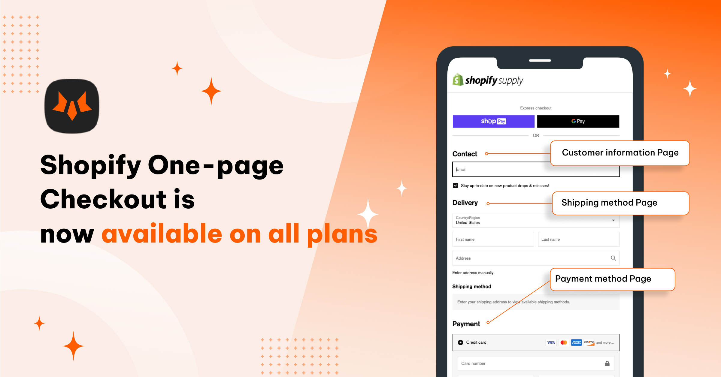
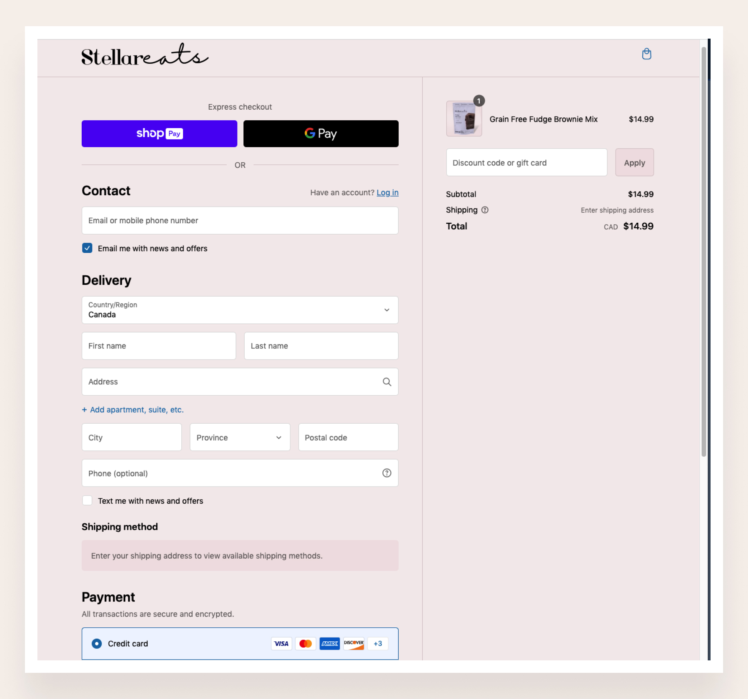
In the traditional checkout process, customers need to go through 3 pages of checkout to complete their order, including Information, Shipping, and Payment. Shopify has evolved the 3-page steps into a more streamlined one-page checkout experience. It is an eCommerce checkout process that condenses all of the elements of a standard checkout process onto a single page, including cart contents, payment details, shipping and billing addresses, and shipping options.
Why should we use a one-page checkout?
Shorter and faster checkout
The one-page checkout on Shopify is like a shortcut to the finish line. It streamlines the entire checkout process into a single page, eliminating the need for customers to navigate through multiple steps. This results in a smoother and friction-free shopping experience. With fewer page loads and a shorter time spent on shipping rate calculations, buyers can complete their purchases with lightning speed. Customers are finishing the new checkout 4 seconds faster on average than the multi-page one.
A successful example of one-page checkout usage is Hemlock & Oak. They implemented Shopify one-page checkout to the store and witnessed a drastic friction reduction in its online checkout.
Easier navigation
With traditional multi-page checkouts, customers often navigate back and forth to locate the specific page they need. Sometimes, they may lose all the information they filled in before when they move back to previous pages to edit information, which can be a cumbersome experience.
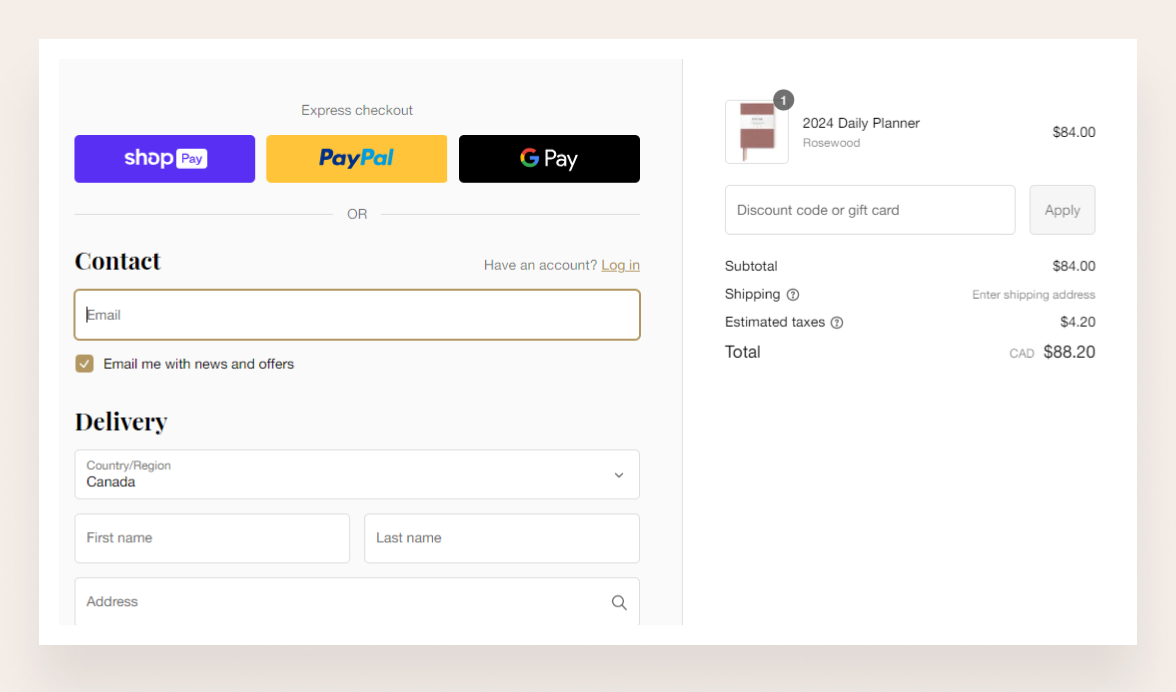
However, a one-page checkout neatly arranges all the elements on a single page. This cohesive design makes navigation a breeze, with customers simply scrolling down to make changes or review orders. No more backtracking to another page and losing input information in the process.
More excellent mobile responsiveness
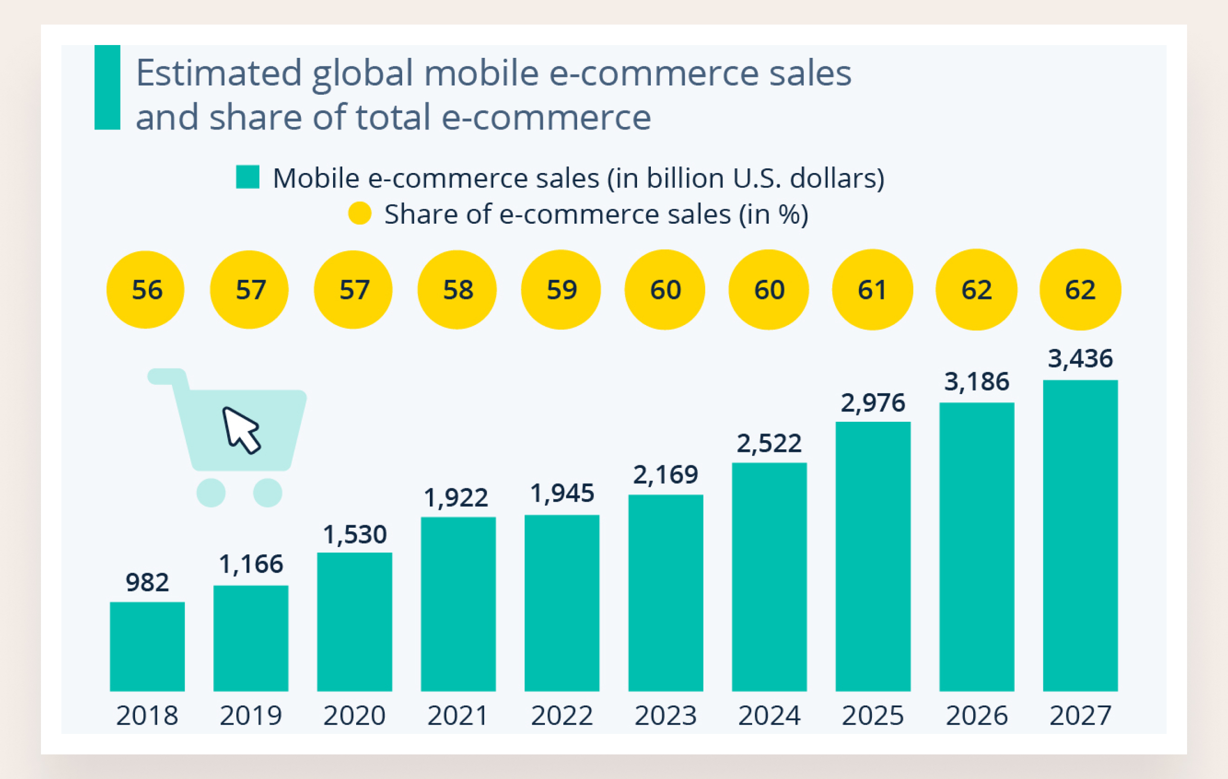
According to Statista's Market Insights, mobile eCommerce, or M-commerce, has experienced steady growth and now constitutes 60% of all online sales worldwide. Thus, in a mobile-driven world, the adaptability of your checkout process to different devices is paramount.
The one-page checkout excels in this regard. Since users aren't required to click through extra pages or switch between tabs to complete their checkout, it naturally lends itself to mobile optimization. Furthermore, having all checkout elements on a single page simplifies making your checkout mobile-friendly from the get-go.
Lower cart abandonment
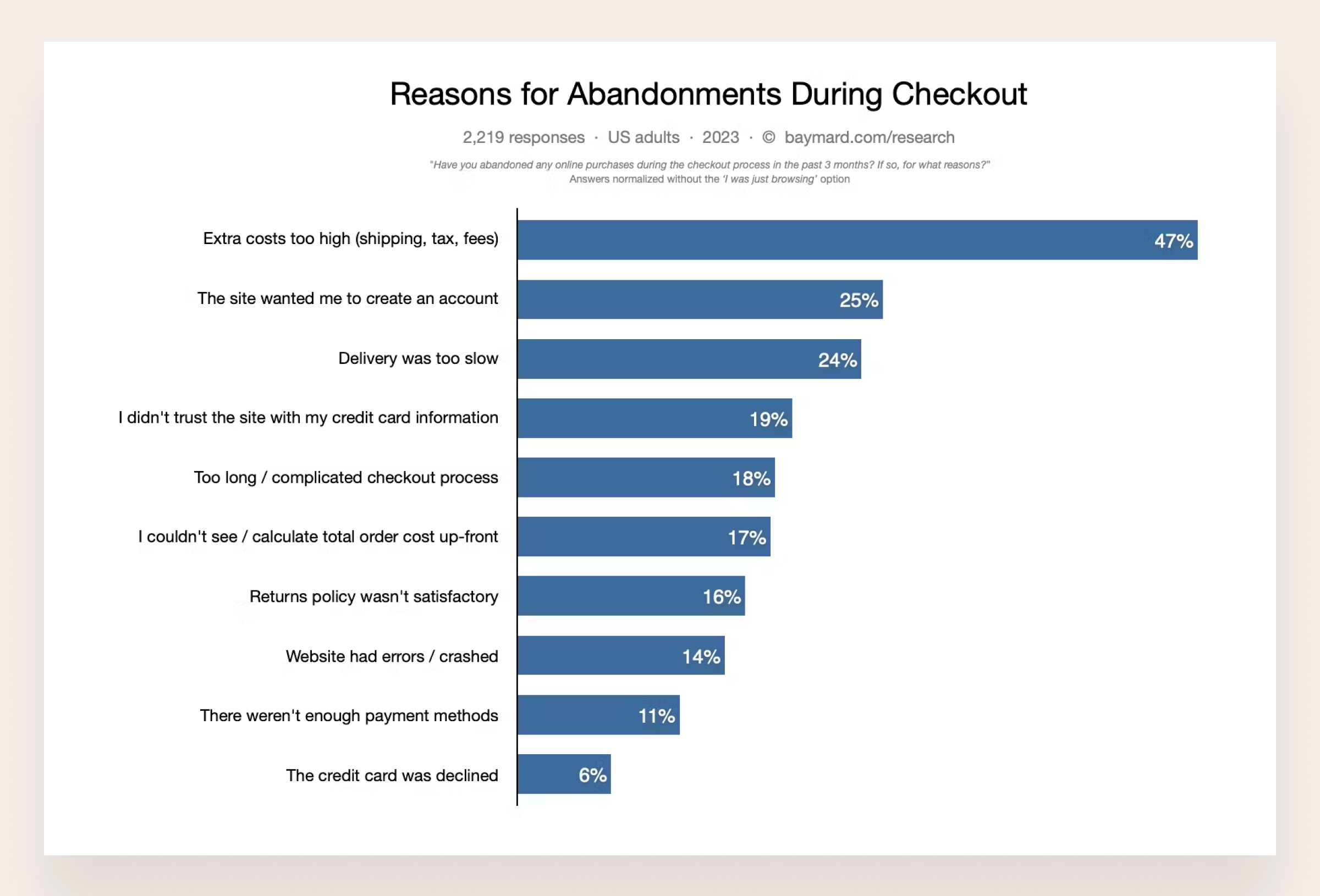
One of the primary reasons customers abandon their cart is the long and complicated checkout process. According to some surveys, 18% of US customers and 33% of European consumers leave their cart for this reason.
One-page checkout can reduce the cart abandonment rate of your store significantly. Eliminating the complexities of a multi-page checkout helps customers complete their purchase journey without getting frustrated or distracted.
Higher conversion rate
By providing a faster, more user-friendly checkout experience, a one-page checkout tends to boost conversion rates. Reducing friction and steps in the process often translates to more completed transactions, increasing sales and revenue.
Many Shopify stores also prove their effectiveness. Some examples of one-page checkout usage are Stella Eats, with a 3.5% increase in conversion rate; Hemlock & Oak, with a 7% increase in conversion rate; and Digismoothie, with a 7.5% increase in conversion rate.
One-page checkout vs Multi-page checkout: Which is more suitable for your store?
Although many merchants assume that one-page checkout is better than multi-step checkout, it may not be a one-size-fits-all option. So which store is best fit with one-page checkout?
As one-page checkout incorporates all pages into one, this page may become long and confusing. Thus, this checkout page is especially suitable for stores selling digital products that don’t require a shipping information field.
A significant advantage of one-page checkout is that purchasing requires less time and effort. It will be especially useful for stores that deal with inexpensive or one-time-purchase products that don’t need much consideration when making buying decisions.
Moreover, while multi-step checkout pages take more time from the customer, some online shoppers actually prefer them because they give customers more opportunities to think carefully through their purchase and confirm all necessary information. According to a survey conducted by Miva, customers purchasing expensive items online prefer a multi-page checkout versus a single-page checkout.
Besides, one-page checkout may limit the information collection so it’s particularly useful for digital products because there is usually less information required from the customer to complete the order. In particular, customers will not need a shipping address or shipping method for their order.
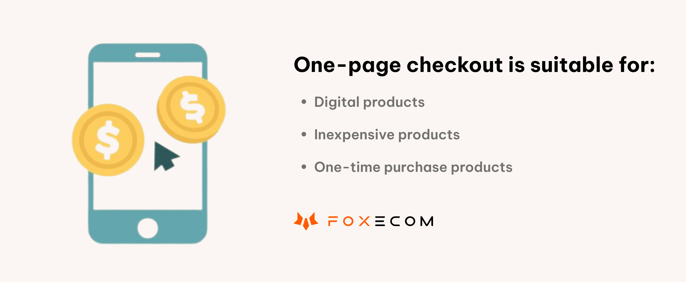
To conclude, the one-page checkout will be suitable for stores selling these types of products:
- Digital products
- Inexpensive products
- One-time-purchase products
How To Activate Shopify One-Page Checkout?
As Shopify announced, if you are on the Basic, Shopify, and Advanced plans, your checkout will be auto-updated to the new design by the first week of October 2023.
If your store is still not updated, you can check and update yourselves with this guideline:
- Go to your Shopify store admin > Settings > Checkout
- You should see an informational banner at the top of the section about the upcoming auto-update. Click on the "Update checkout now" button. Alternatively, you can check the preview by clicking the link "Preview the new one-page checkout."
- Go to your store and test it properly.
However, please note that once you switch to the one-page checkout, you can only return if you're a Shopify Plus user.
Suppose you’re in the Plus plan using the checkout extensibility and want to roll back to the traditional multi-page checkout. In that case, you can select a simple layout from one-page to multi-page via the theme editor.
Are you ready to switch to the one-page checkout?
We understand you want to learn more about one-page checkout before switching to it so this article provides essential information about one-page checkout and the detailed guidance to activate one-page checkout for Shopify stores.
However, there's no one-size-fits-all approach.
To make a one-page checkout align with your unique business needs and customer preferences, you must tailor and optimize it.
In part 2 of this article, we’ll provide you with 5 expert tips to optimize your checkout page.
If you need a helpful assistant to customize the checkout page and urge customers to come to the checkout page, we also have one for you. Let’s discover the ultimate Shopify duo of Minimog x FoxKit, the combo between a next-gen, high-converting theme and a powerful upsell and sales-boosting app!


